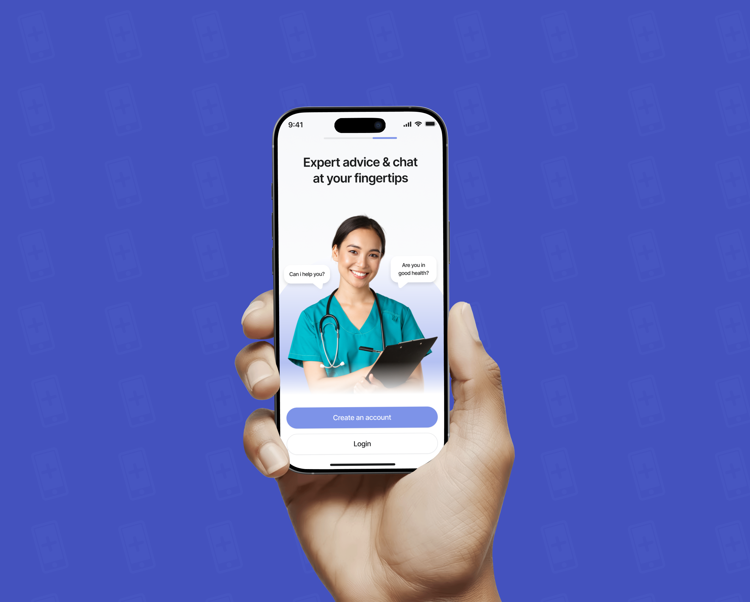
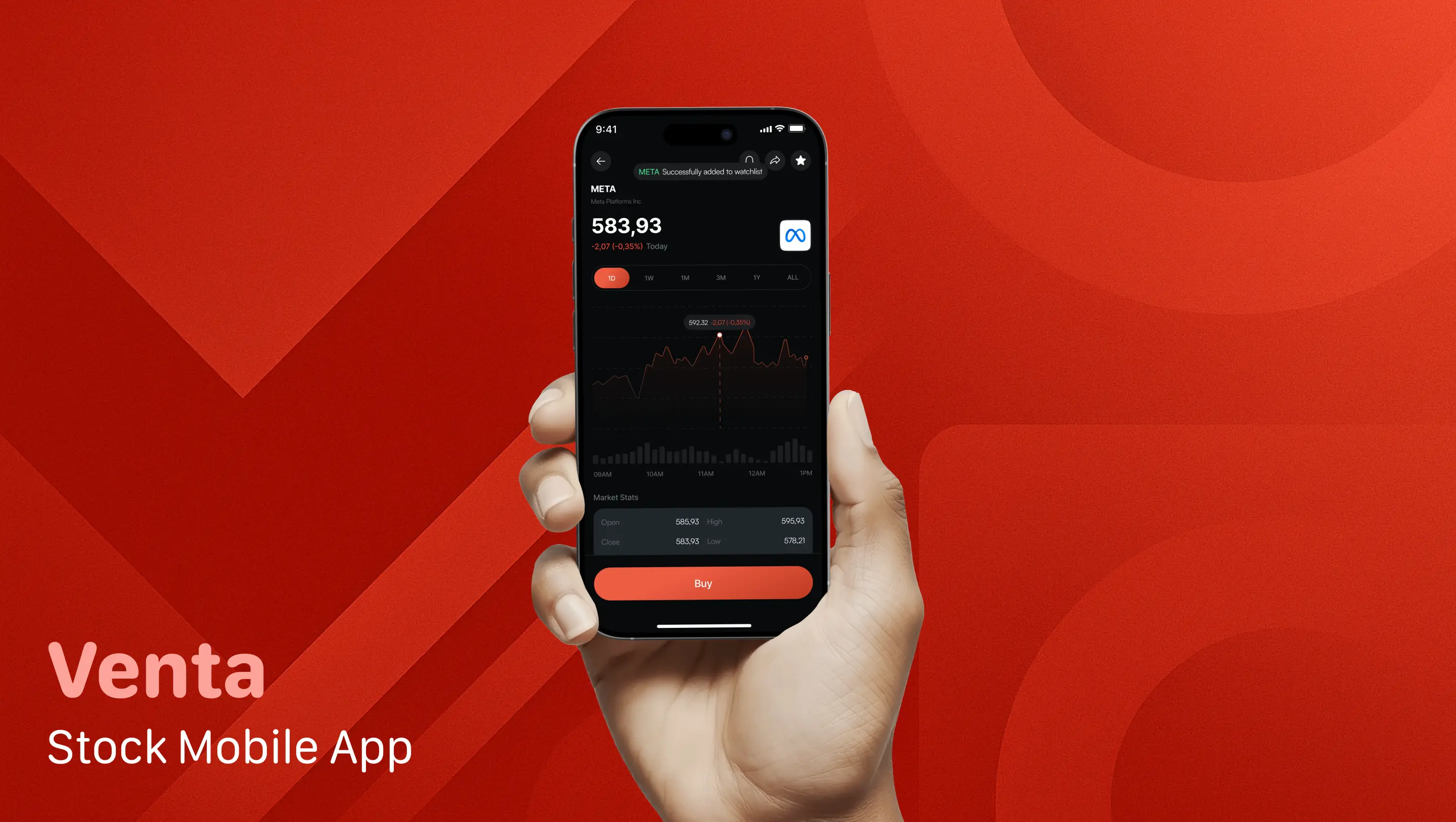
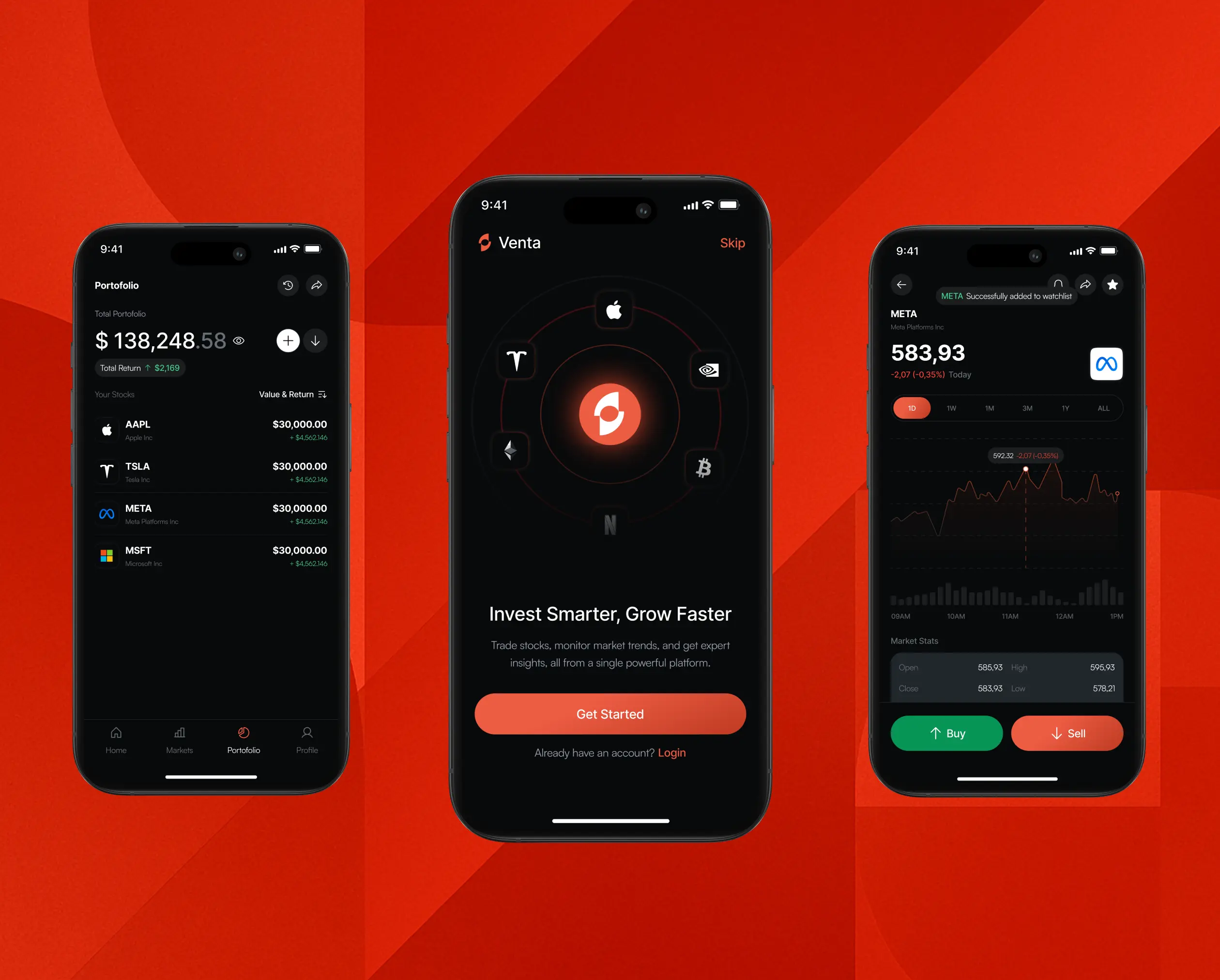
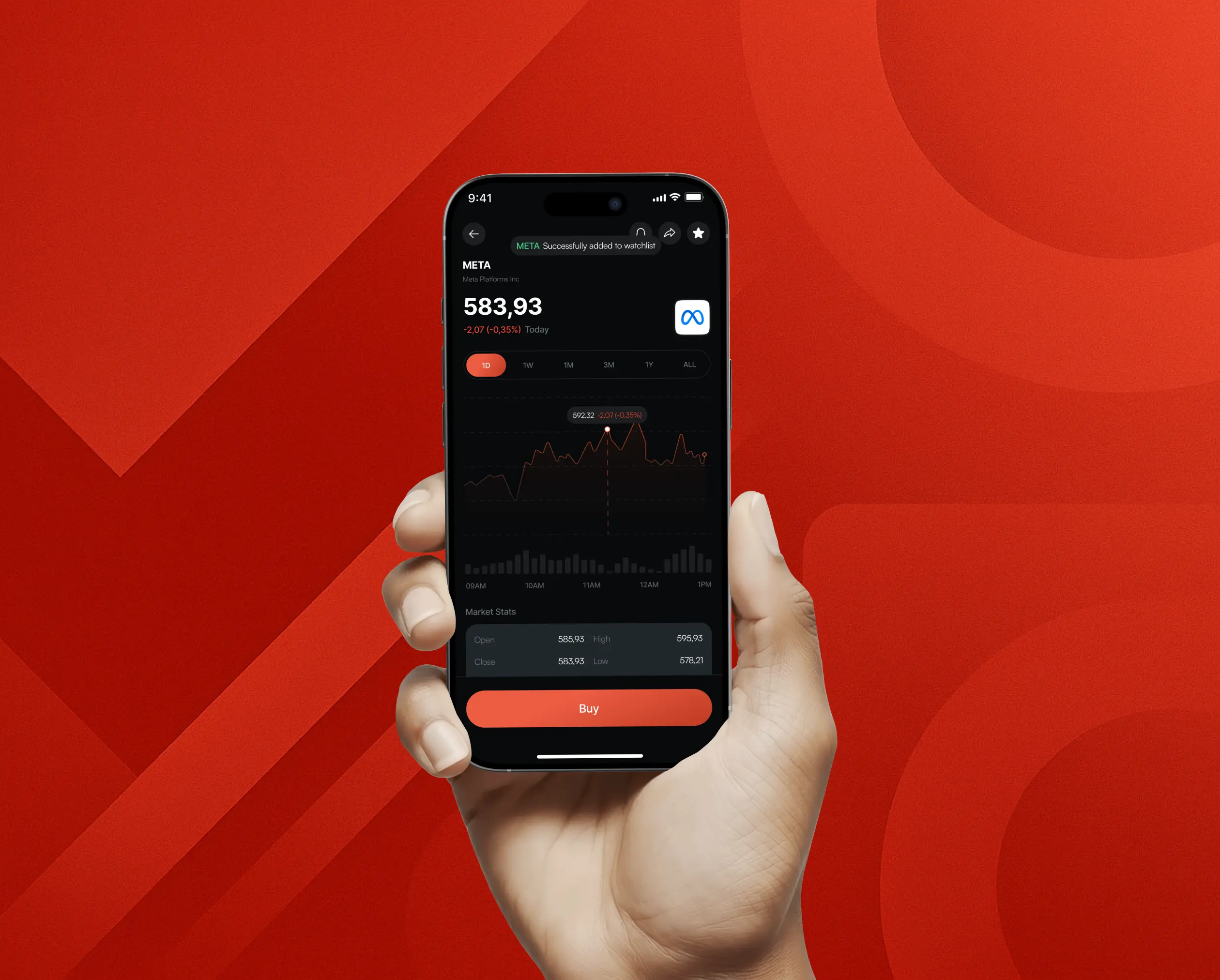
Venta - Stock Mobile App
Redesigned and expanded the Venta mobile app to deliver a seamless, secure, and user-friendly experience for retail investors—from account setup to active trading. Focused on creating an intuitive onboarding flow, real-time portfolio insights, and simplified transactional flows for deposits, withdrawals, and stock trading.
Project
Venta - Stock Mobile App
Category
Ui/Ux Design
Fintech Product Design
Client
Venta
Year
2025
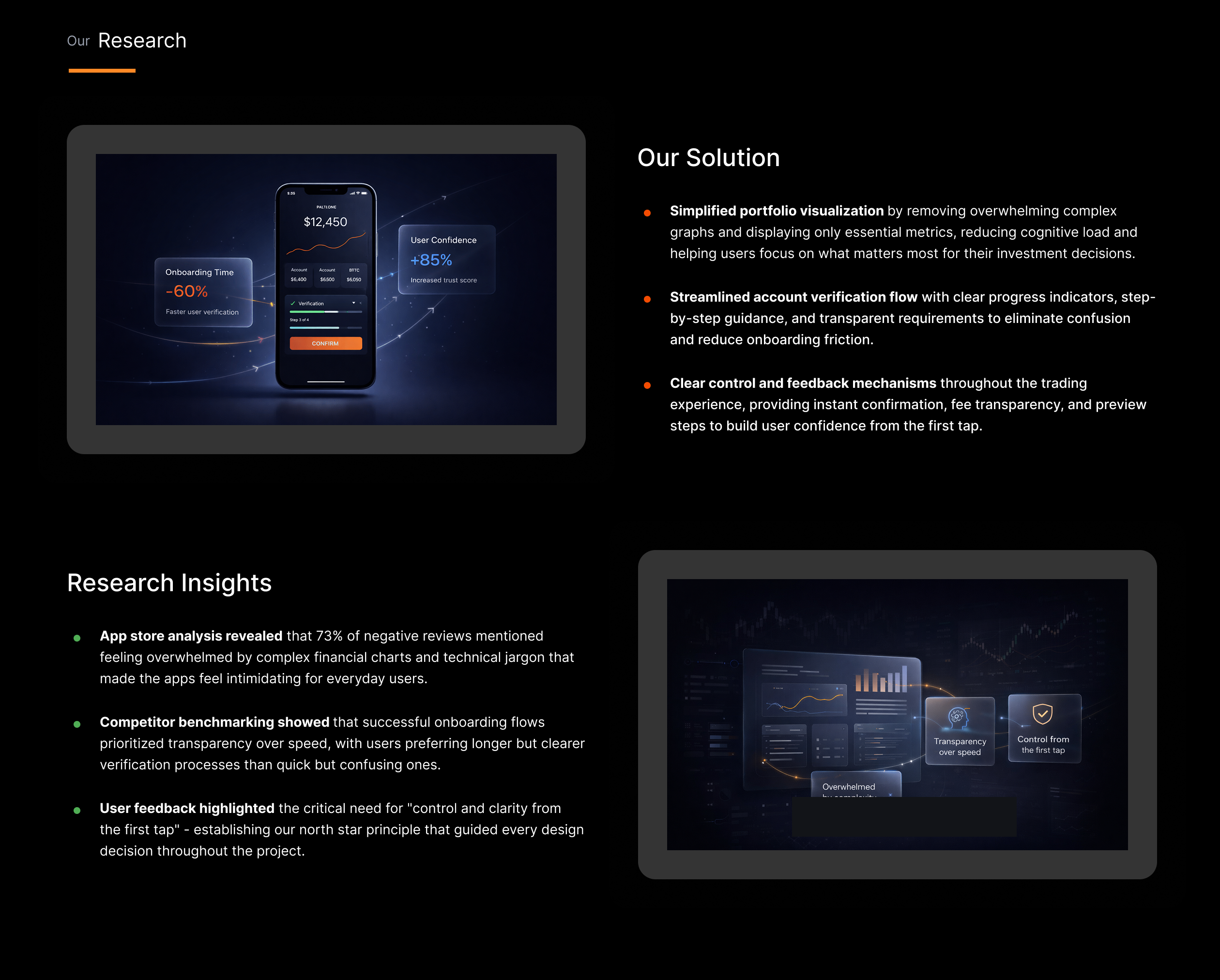
The Starting Point
The idea behind Venta was to offer a smart yet simple investment tool tailored for everyday users—not finance pros. The design challenge was to craft a flow that balanced accessibility with compliance and trustworthiness.
I led the product design end-to-end, working closely with both engineering and product to ensure our vision was cohesive and technically sound.
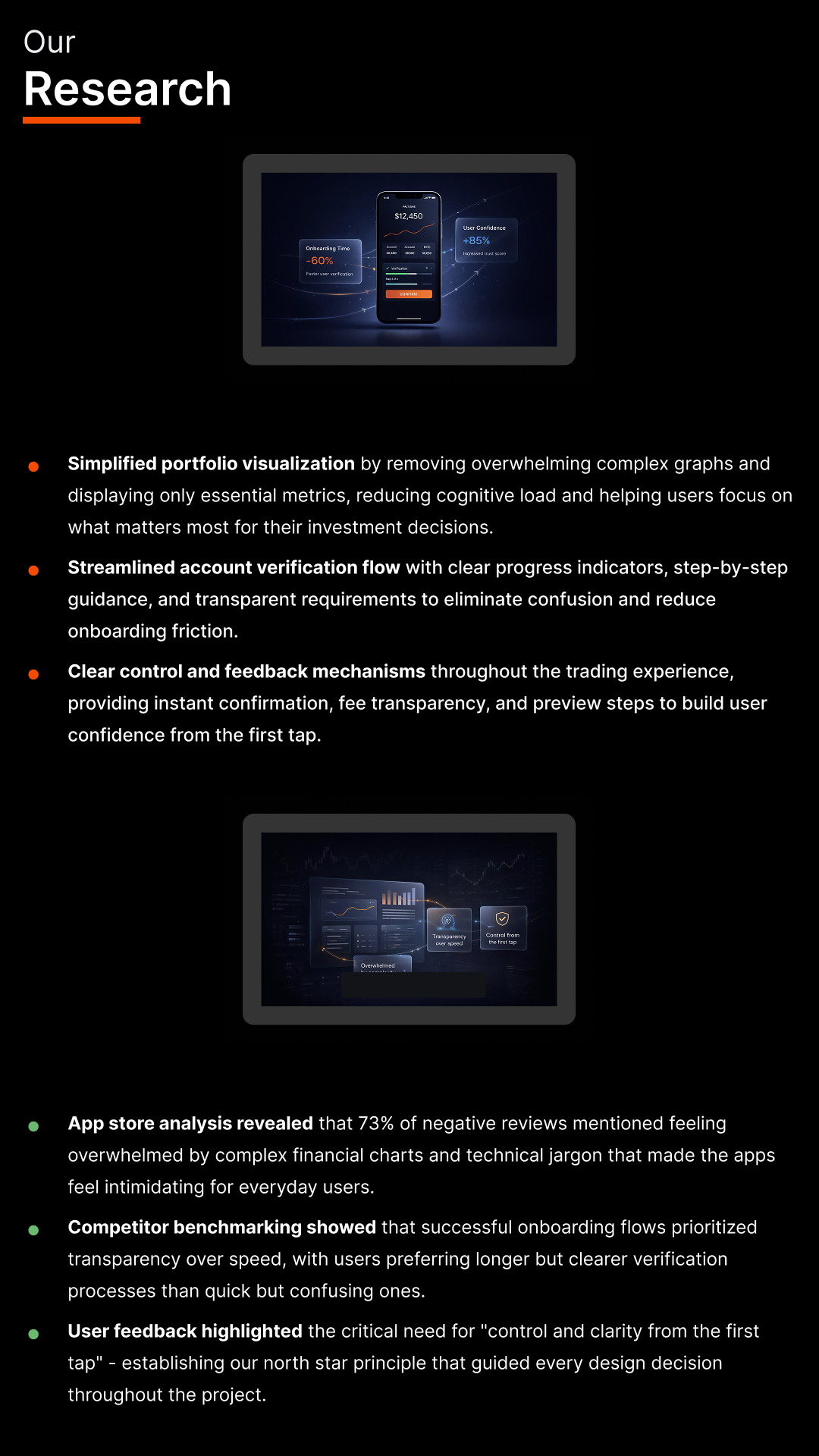
Immersive Research
We kicked things off by benchmarking popular investment apps, diving into app store reviews. People often felt overwhelmed by complex graphs or frustrated by confusing account verification steps.
This helped us define a north star: give users a sense of control and clarity from the first tap.
Reframing the Experience
We kicked things off by benchmarking popular investment apps, diving into app store reviews. People often felt overwhelmed by complex graphs or frustrated by confusing account verification steps.
This helped us define a north star: give users a sense of control and clarity from the first tap.
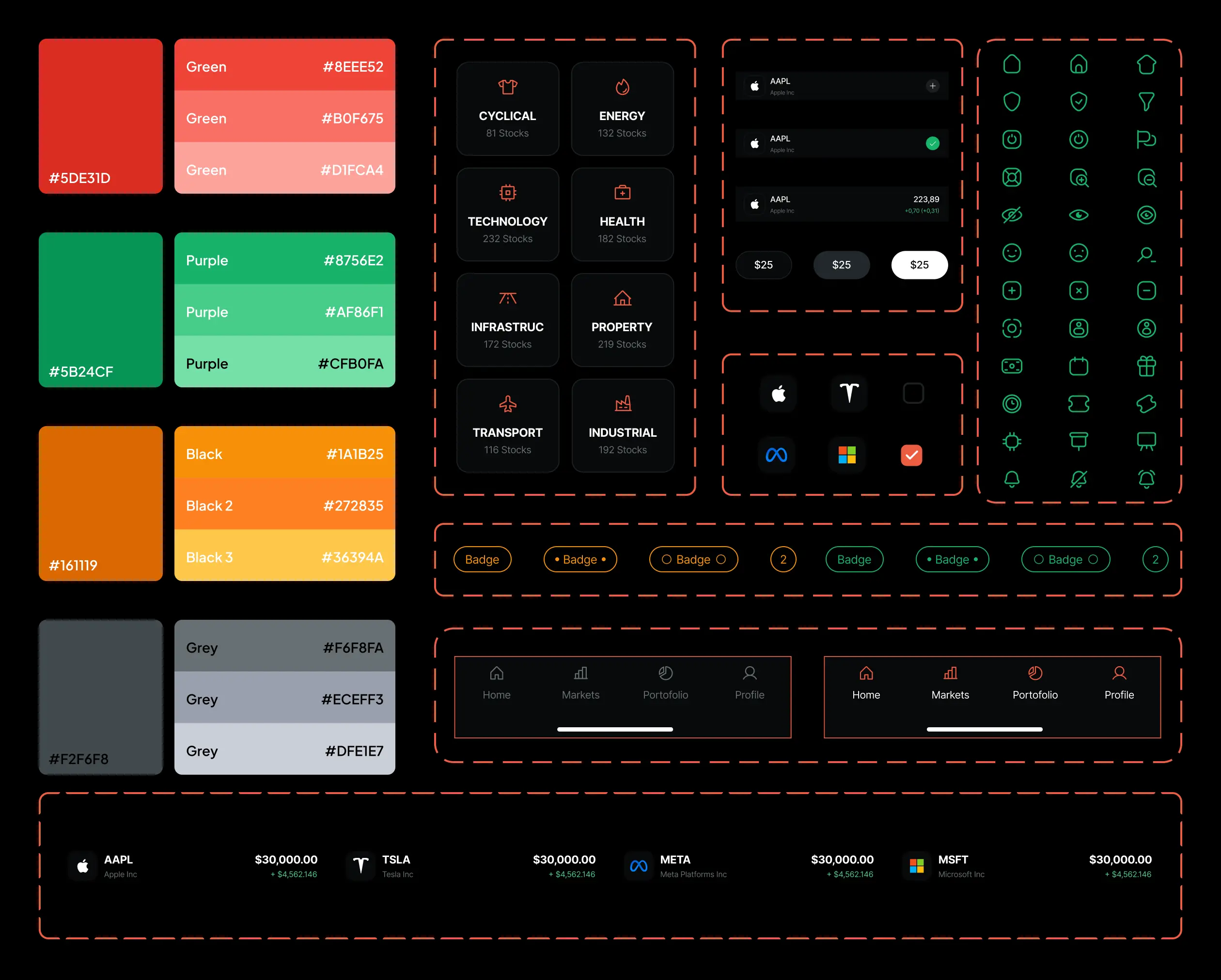
Creating a Cohesive Component System
We kicked things off by benchmarking popular investment apps, diving into app store reviews. People often felt overwhelmed by complex graphs or frustrated by confusing account verification steps.
This helped us define a north star: give users a sense of control and clarity from the first tap.
Designing with Empathy & Iteration
We kicked things off by benchmarking popular investment apps, diving into app store reviews. People often felt overwhelmed by complex graphs or frustrated by confusing account verification steps.
This helped us define a north star: give users a sense of control and clarity from the first tap.
Results & Outcomes
We kicked things off by benchmarking popular investment apps, diving into app store reviews. People often felt overwhelmed by complex graphs or frustrated by confusing account verification steps.
This helped us define a north star: give users a sense of control and clarity from the first tap.
Reflection
We kicked things off by benchmarking popular investment apps, diving into app store reviews. People often felt overwhelmed by complex graphs or frustrated by confusing account verification steps.
This helped us define a north star: give users a sense of control and clarity from the first tap.
more works
Vibe - Event Mobile App
UI/UX Design

GoParcel - Shipping Mobile App
UI/UX Design

Trusta
UI/UX Design
Venta - Stock Mobile App
UI/UX Design
Shoobie
UI/UX Design

Strive - Workout Mobile App